Métier
Find a place that value your skills

The Problem
Moving to a new country can be a tedious process, especially for those who have a white-collar job or Are in the mainstream industries as it is hard to give up their already well settled life to start fresh in a new place. So, during our third term at Langara we (team of 6) decided to give a solution to this problem through a web platform which we called Métier.
The Solution
Métier is a website which helps people who wants to move to Canada to easily transfer their skills in a city which is the most suitable for them. Métier is a french word which means a trade or profession.
Main Features
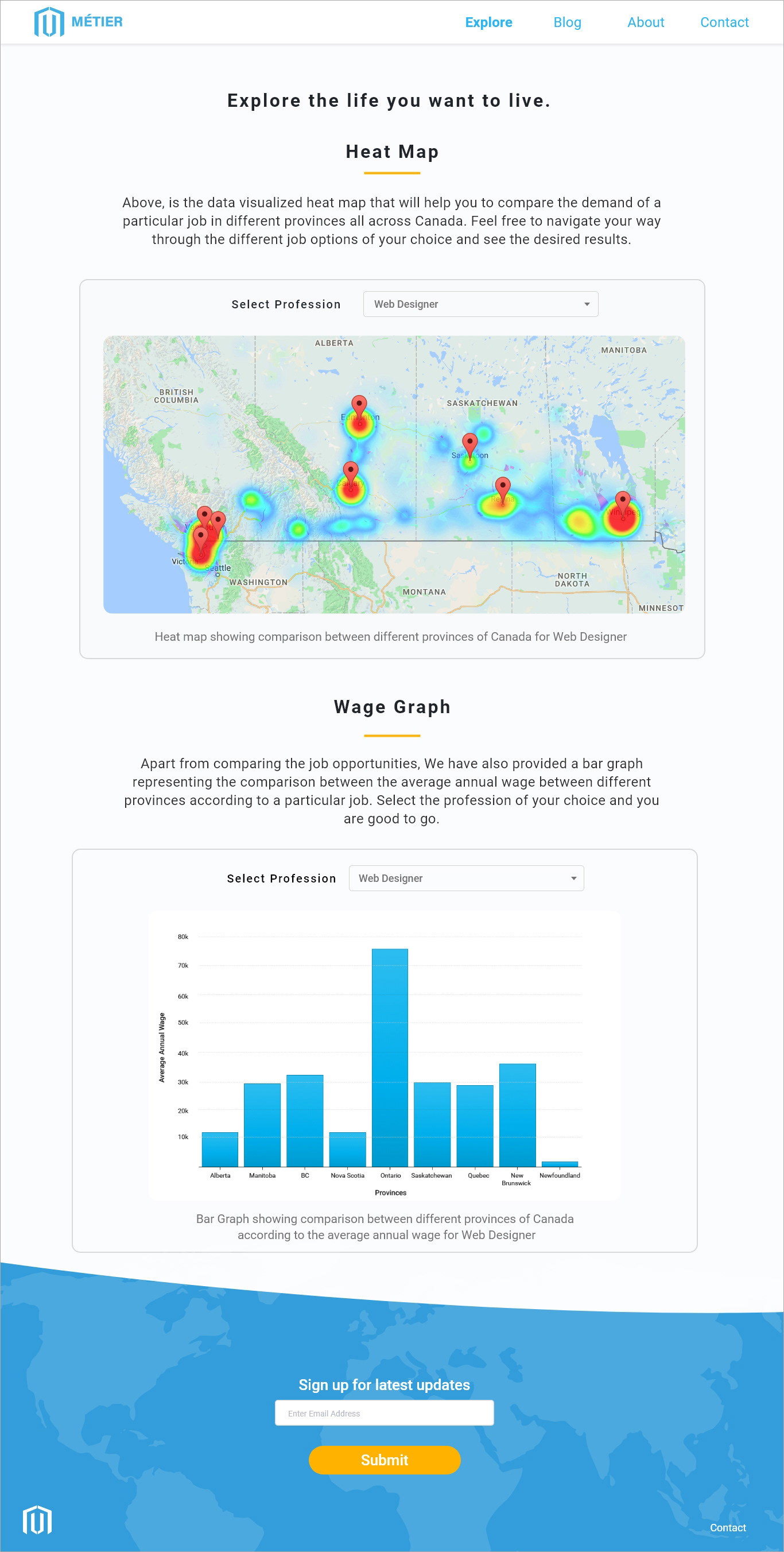
- Comparison of Job opportunities available in Canada
- Comparison of Wages in different provinces of Canada
- Blogs related to jobs
- How to prepare for a particular job
My Role
I lead the design part of the project and also worked on the UI/UX portion
- Drafted a blueprint to give a head start on the research work
- Researched about the target users for the project and created user persona
- Defined the Information Architecture of the website based on discussion with the development team
Tools used
Research
UX Research becomes easy when you have faced the same problem which your target audience are going through. When I was planning to come to Canada as a student, I was also concerned about my career just like every new immigrant and started exploring the internet to find something to compare between different places of Canada but failed to find any good platform. So, at the end, I decided to move to British Columbia because one of my friends has been here already.
For further more research we conducted online surveys, talked to some new immigrants and interviewed few friends from our home countries who are planning to come to Canada.
Findings
- Difficult to decide where to move to Canada
- No better place to compare the demand of any skill in different regions of Canada
- No platform where users can compare wages for their profession in different areas
- No platform where they can compare wages for any particular profession
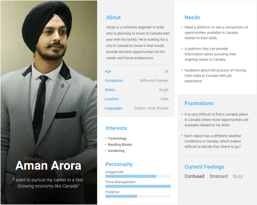
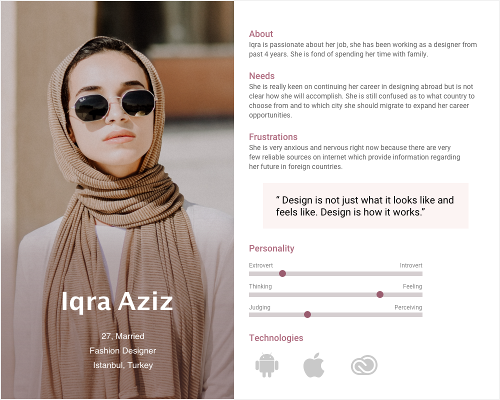
User Personas
Blueprint

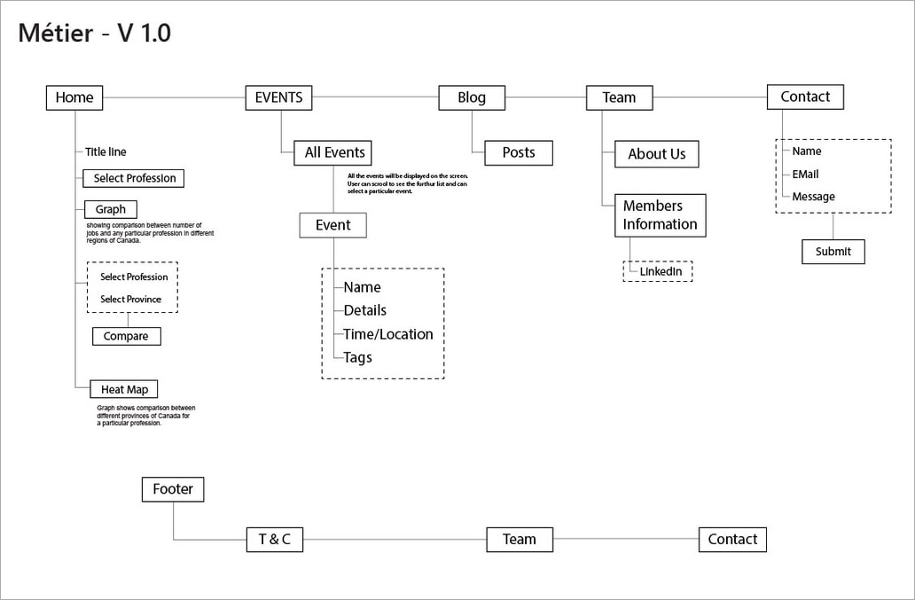
Information Architecture
After the research, the first version of User Flow was created to begin with the wireframes

Wireframes - Final Version
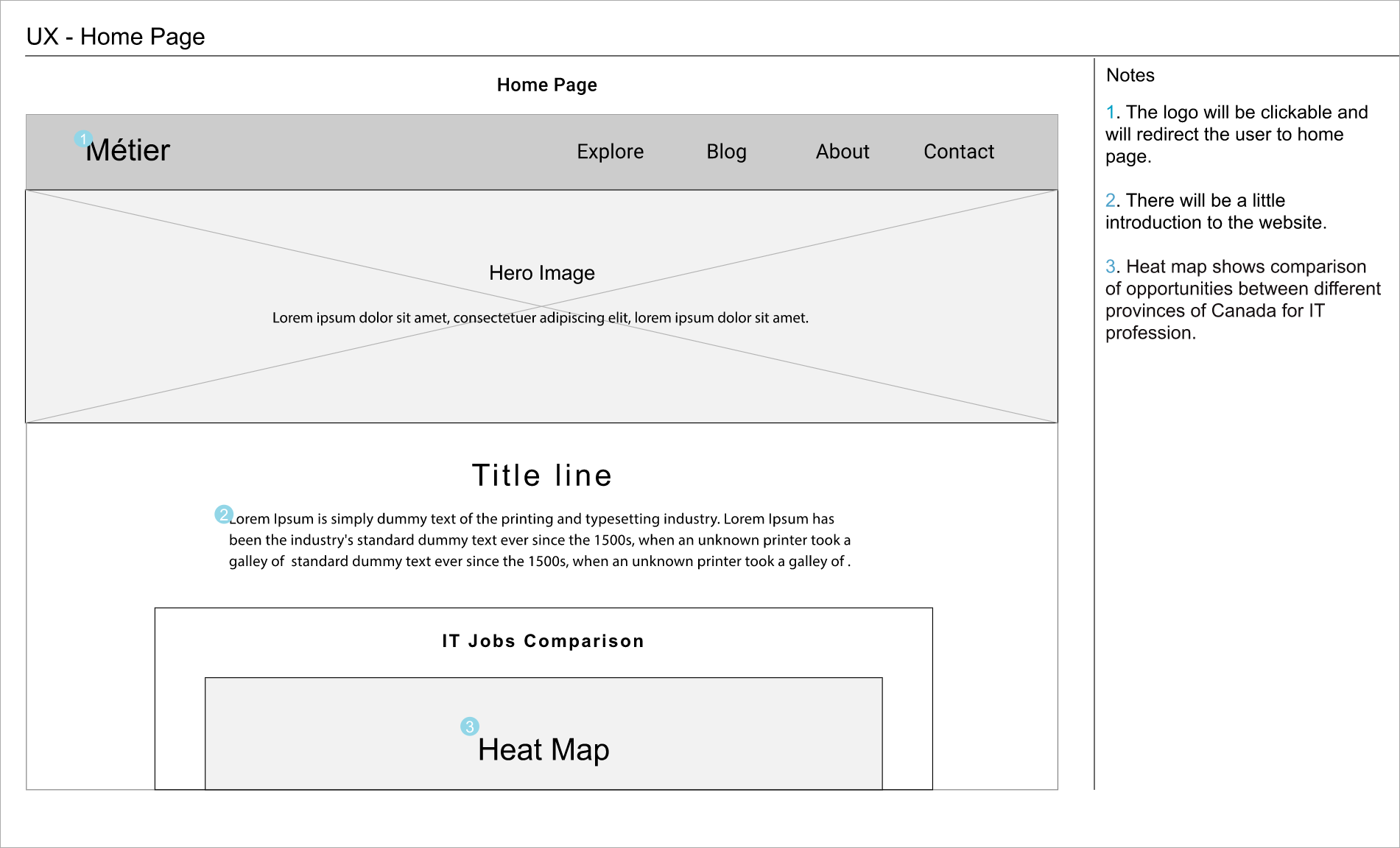
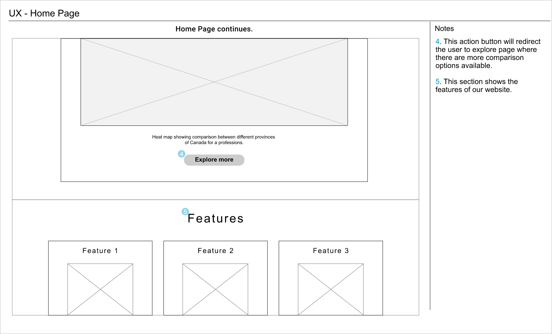
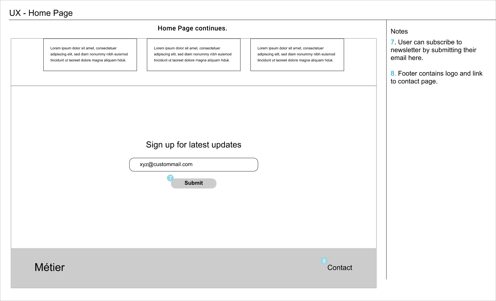

Click here to view complete wireframes
Design
As always, to begin with the design I started with mood board and logo thumbnails. I created a mood board of colors, pictures, typography, layout, icons for reference and drew 20 logos on a white paper and then discussed with other team members to finalize the one which goes best with the project.
Logo Thumbnails, Project logo, Team logo


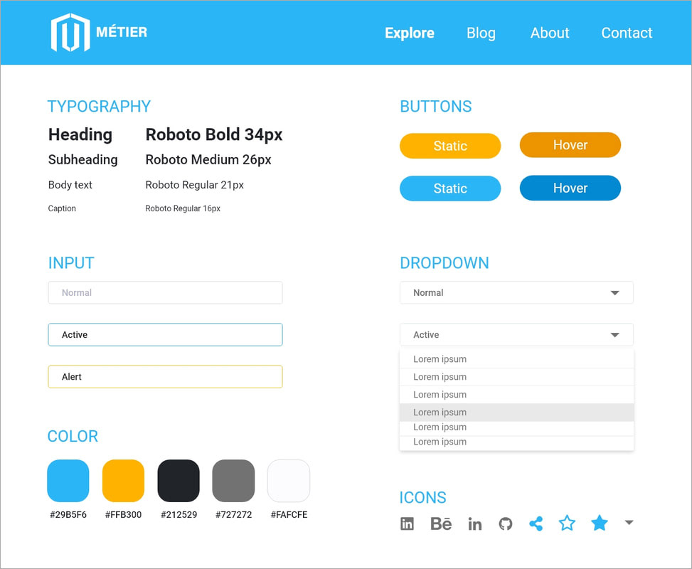
UI Kit
Playing the role of lead designer on my team I took the responsibility to create UI kit where I defined all the graphic elements to be used on the website in order to help other designers and developers as well.
For the Color Palette I choose the contrast of blue & orange and used lighter shades of black and white as neutral colors.
For Typography I choose Roboto font family because this was an informational website displaying lots of information so need font which should be easy to read and Roboto is considered as one of the best fonts from a UX perspective.
Mock-ups

Click here to see the prototype
Thank You!