Athlete Tracker
A step towards fitness!
Athlete Tracker is a mobile application that focuses on all such users who face difficulty in maintaining the record of their workout sessions, eating habits and sleep time. The App also focuses on maintaining a connection between the Trainer and Student (Trainees) so that they can have frequent conversation and can give and take feedback.
Main Features
- Online training schedule
- Custom diet plan
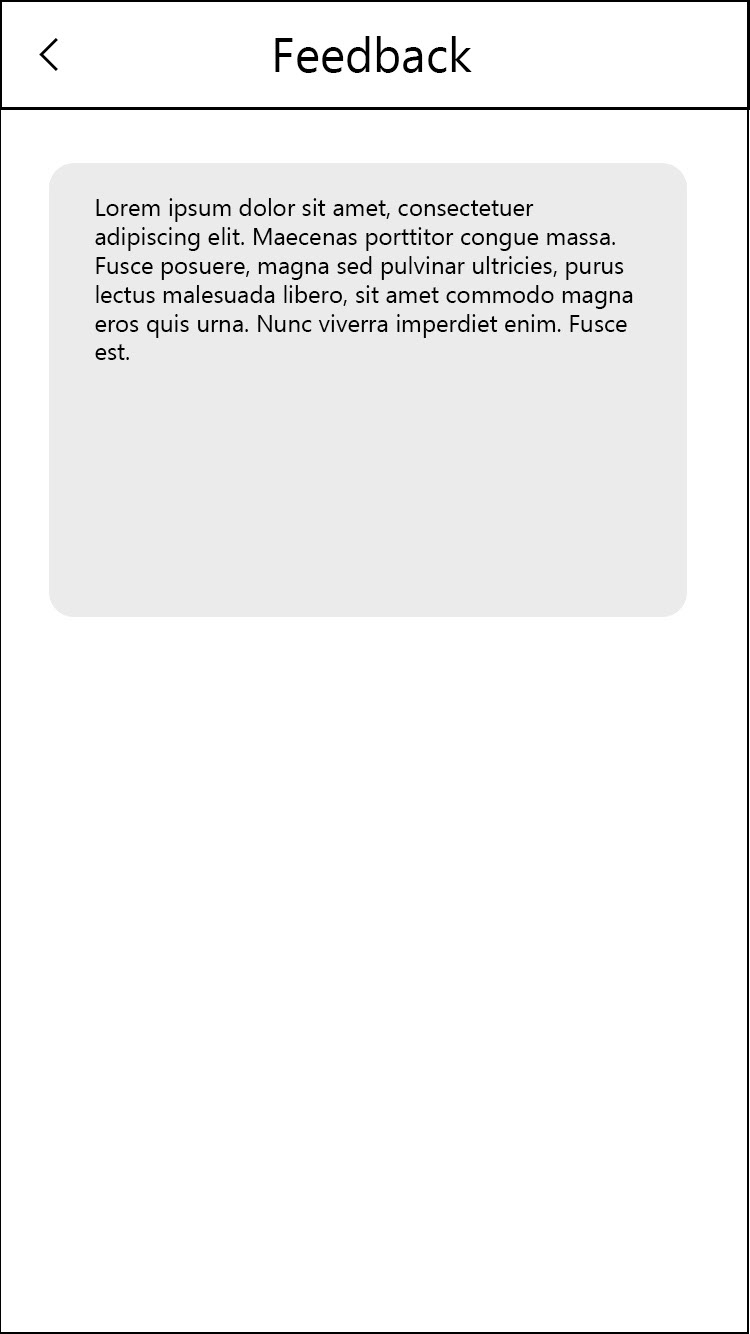
- Instant feedback
- Weekly progress report
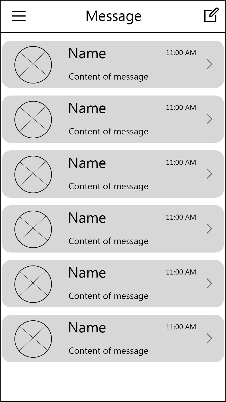
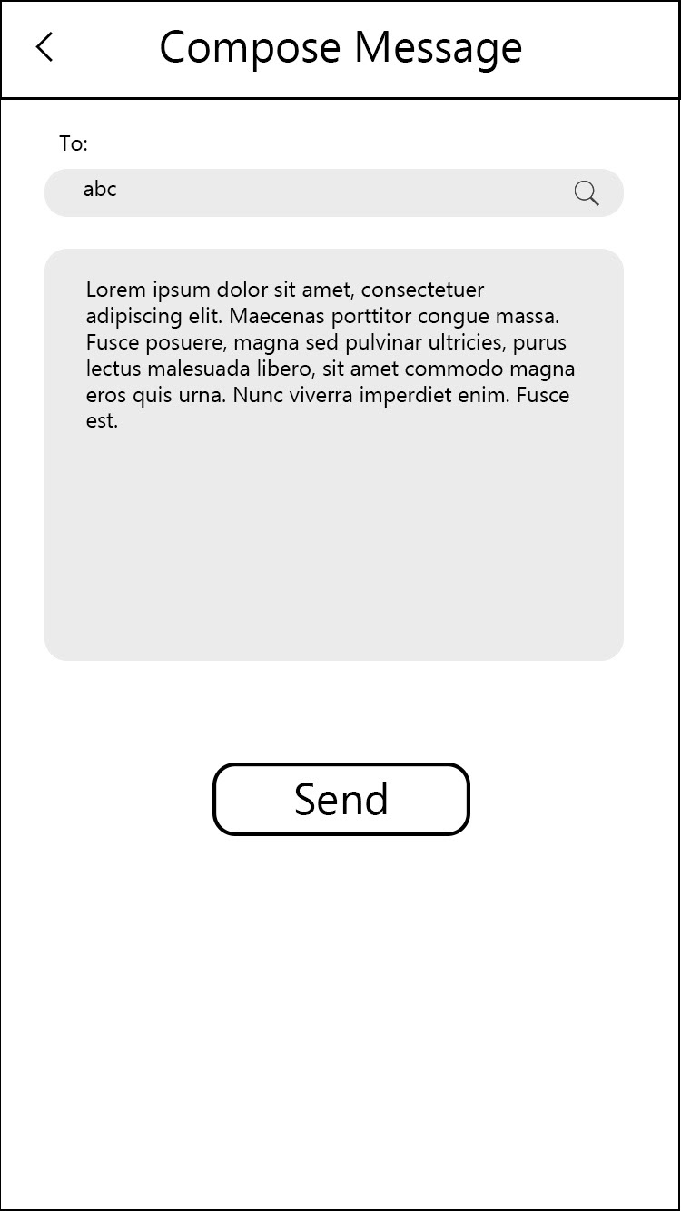
- Direct communication
Tools used

My role
UX/UI Designer
Research
Before starting the actual research process, we did a study about people whom we are going to target for the application. In order to design a mobile application with great user experience it is very important to identify the needs of the target audience. We did face to face interview with three gym trainers and four trainees and know about their frustrations during the training session. We also used Google forms to do online survey.
Result
After completing the interviews we wrote down all of the responses and identified several user needs such as:
- Communication Gap: Coaches find it difficult to be always available for the trainers because of their busy schedule.
- Maintaining records: It was difficult for both to maintain records of training.
- Affect on results: As the records were difficult to maintain so the final results were getting affected.
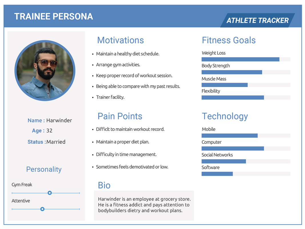
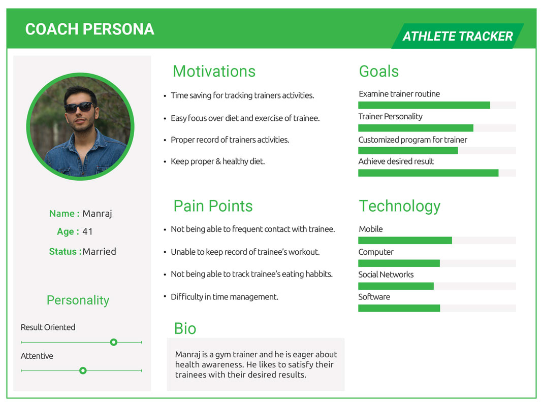
User Personas
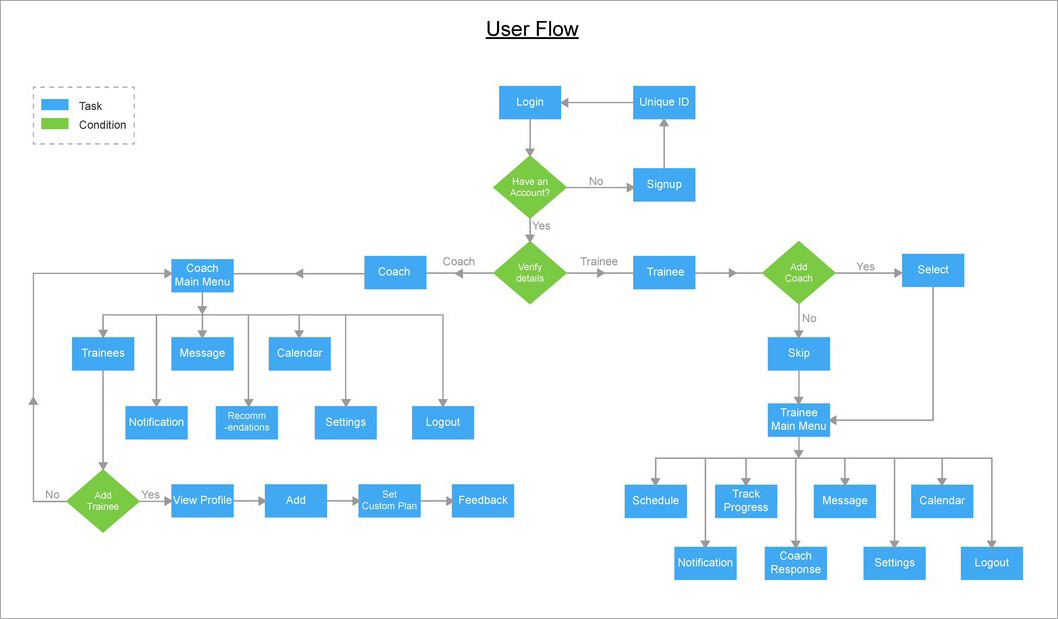
User flow
Based on the research, I created a user flow, which laid out the structure and organization of the content of the application.
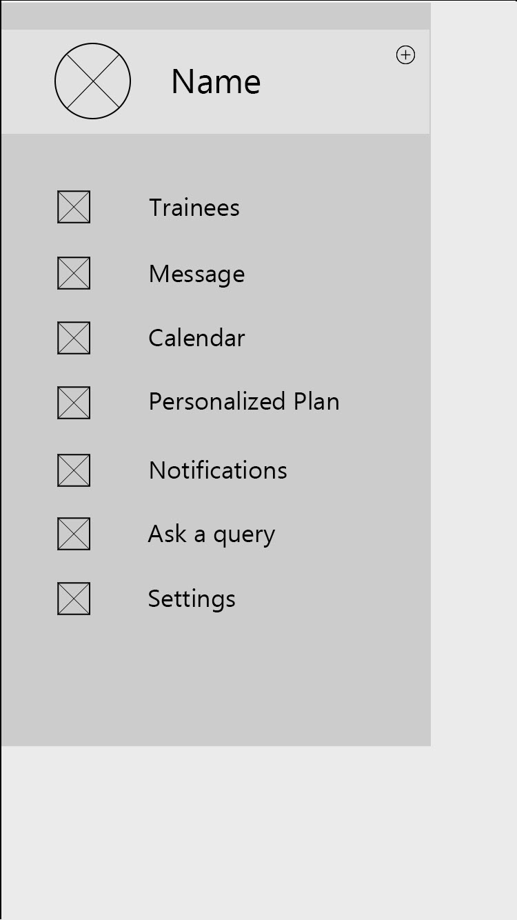
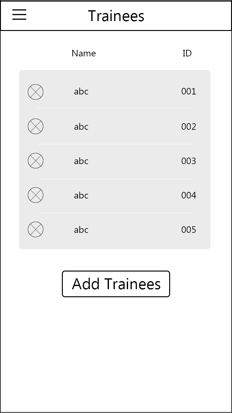
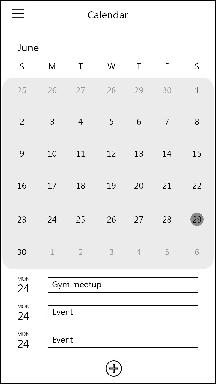
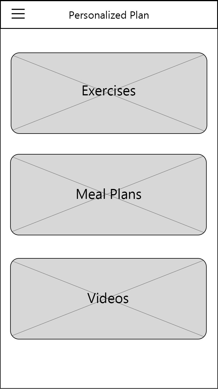
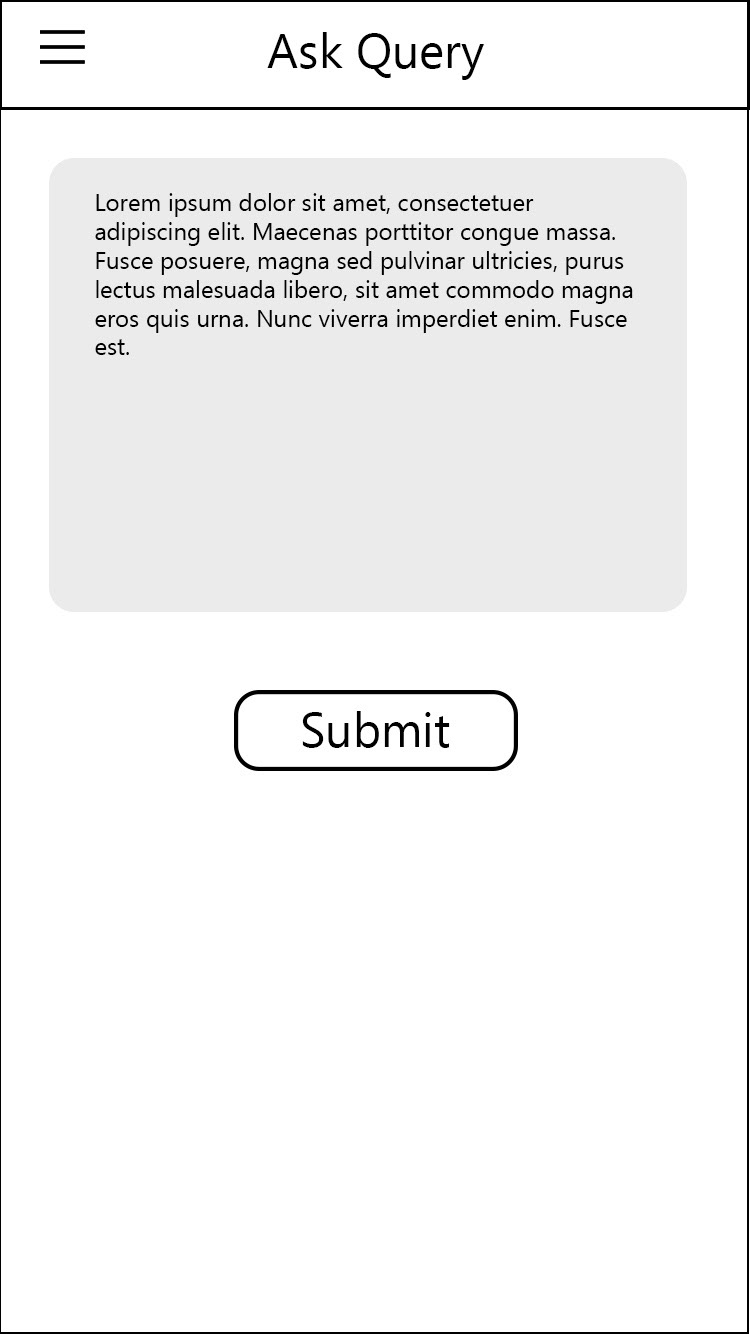
Wireframes
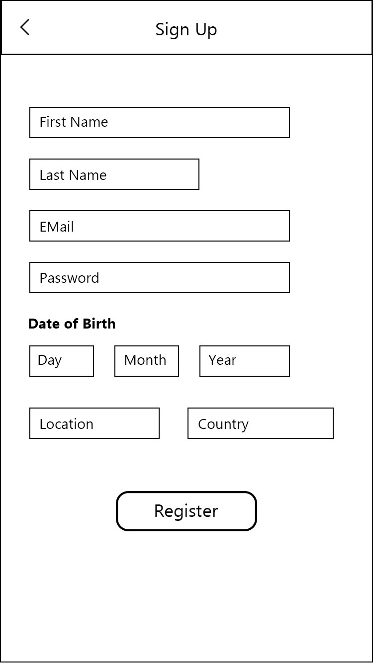
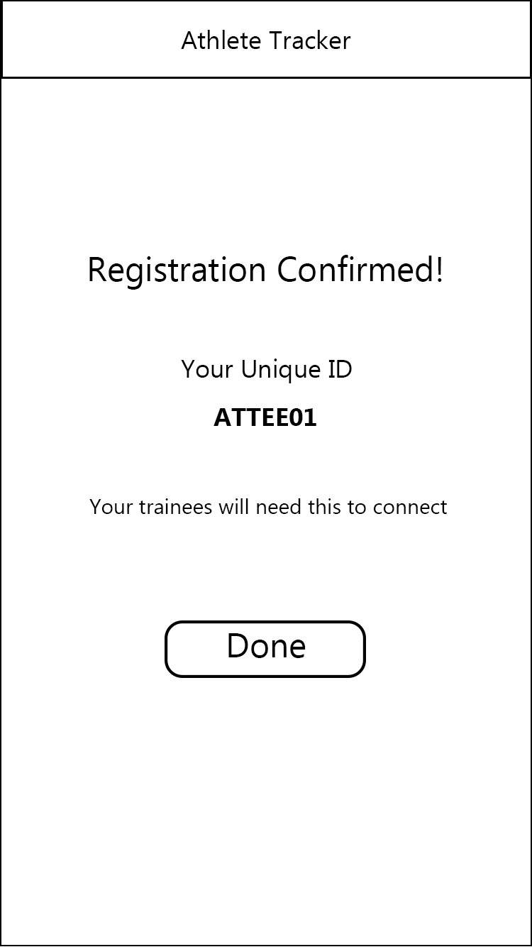
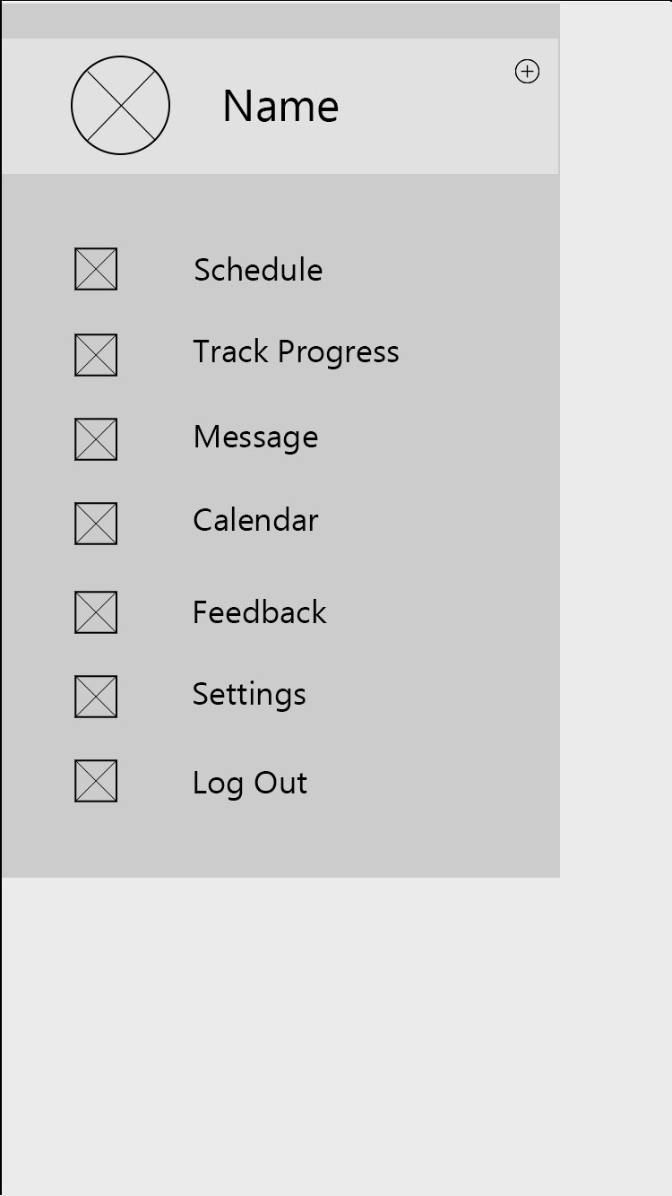
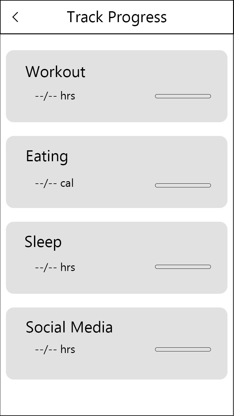
At this point I thought about how the application should look like and created mid-fidelity wireframes in Adobe XD.
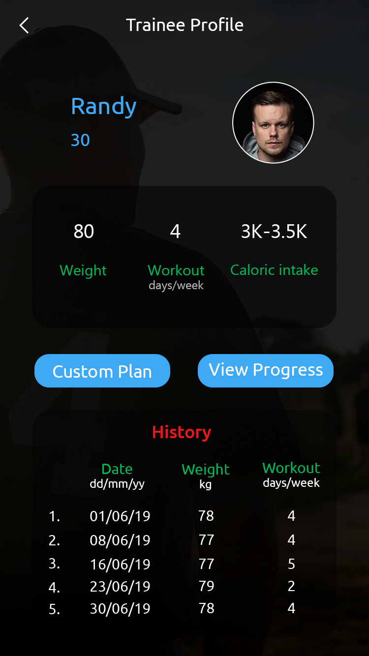
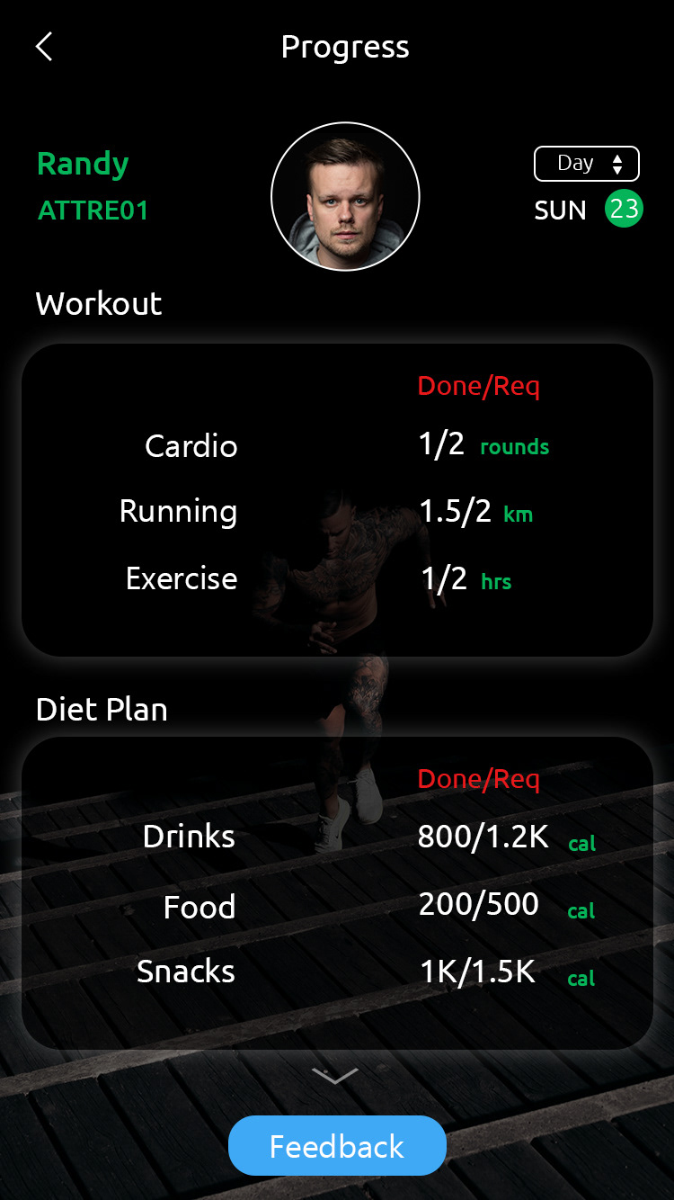
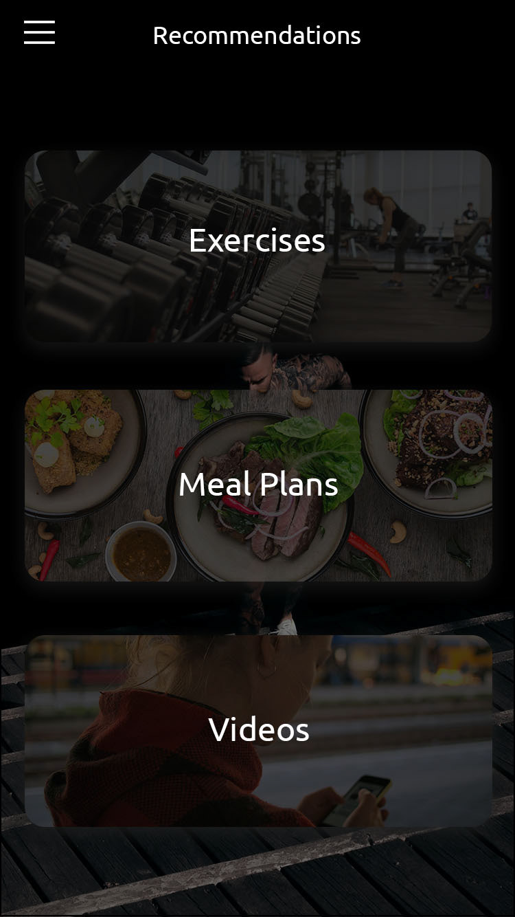
Trainee (Student):


Trainer (Coach):


Design
At this stage I started thinking about how the application should look. I wrote some adjectives that will describe the application and brand: Trust, Fresh, Confident, Faith, Modern. After this I created a mood board of colors, pictures, typography, layout, icons for reference.
Click here to see the mood board on InVision.
Click here to see the mood board on InVision.
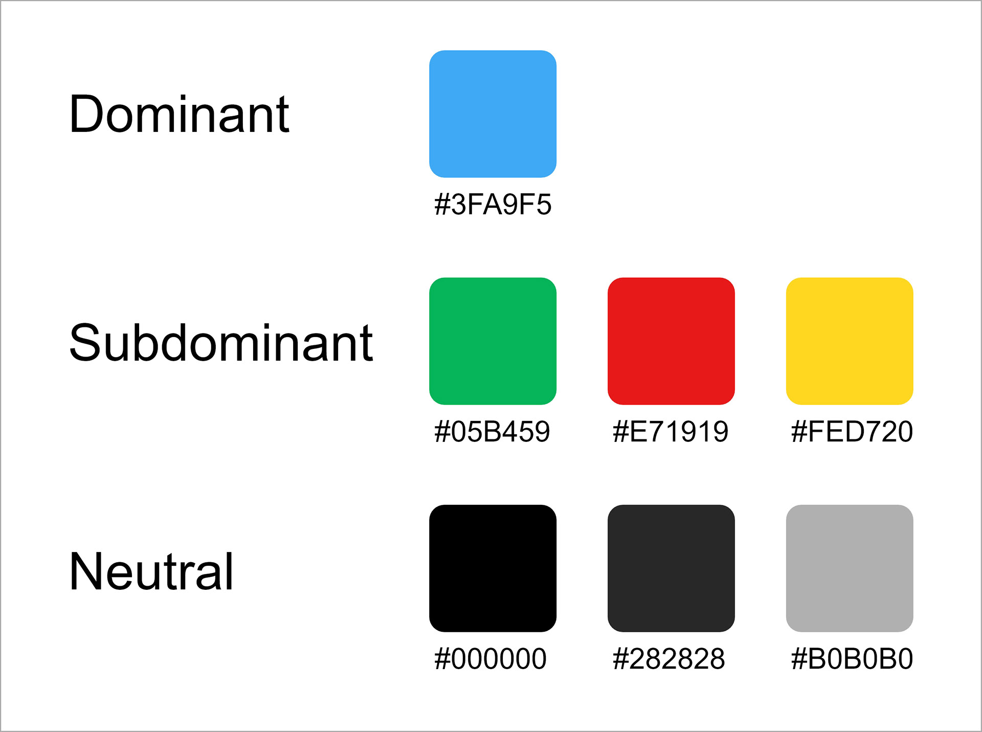
Color Palette & Icons
This was one of my school project and the primary focus was on highlighting the UX process and steps followed to make a better design. So, we were not allowed to spend much time on designing logos and icons, so I used icons from the internet and created logo by combining two icons that were related to our application. For Color palette I used blue as the dominant color because blue represents trust, faith and it is also considered as beneficial for the mind and body.

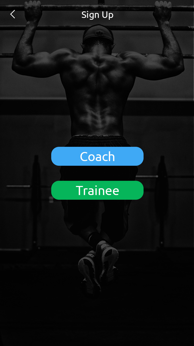
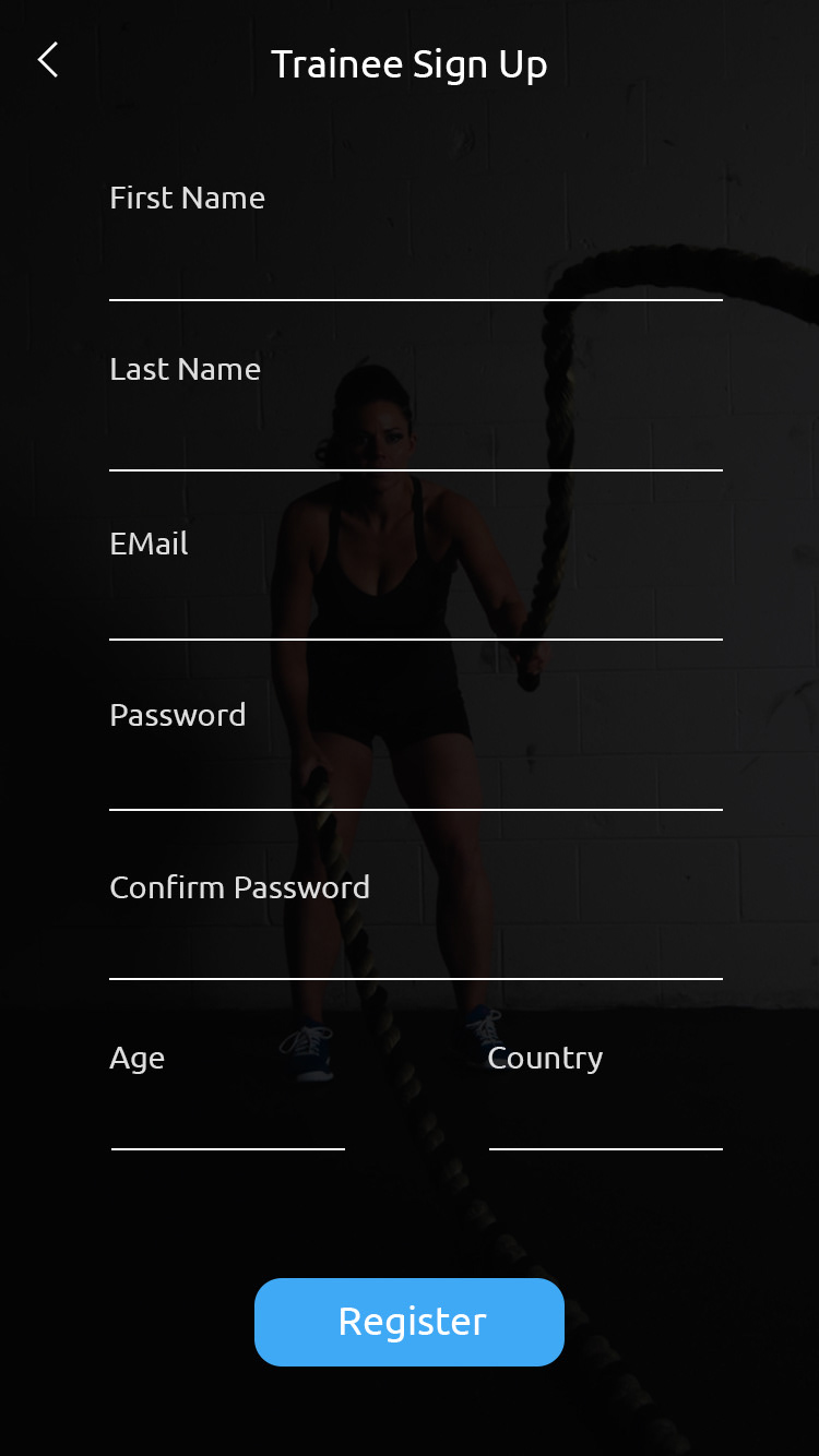
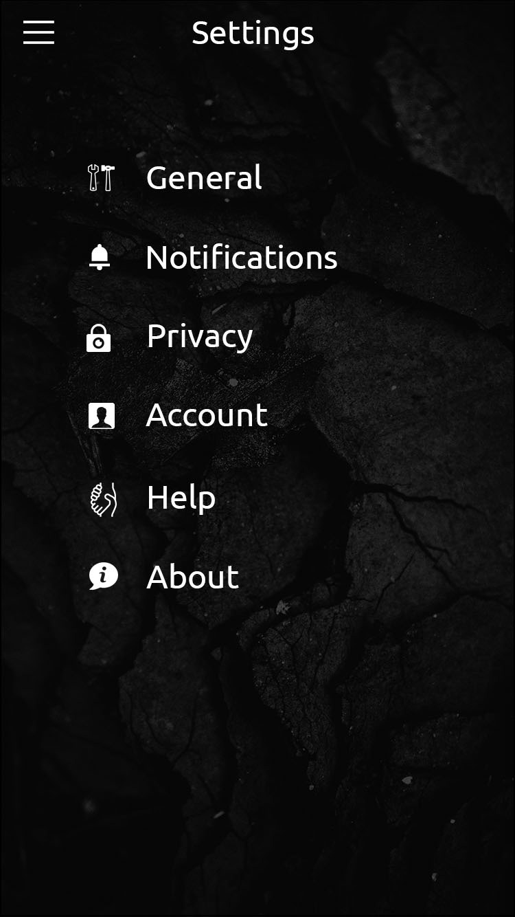
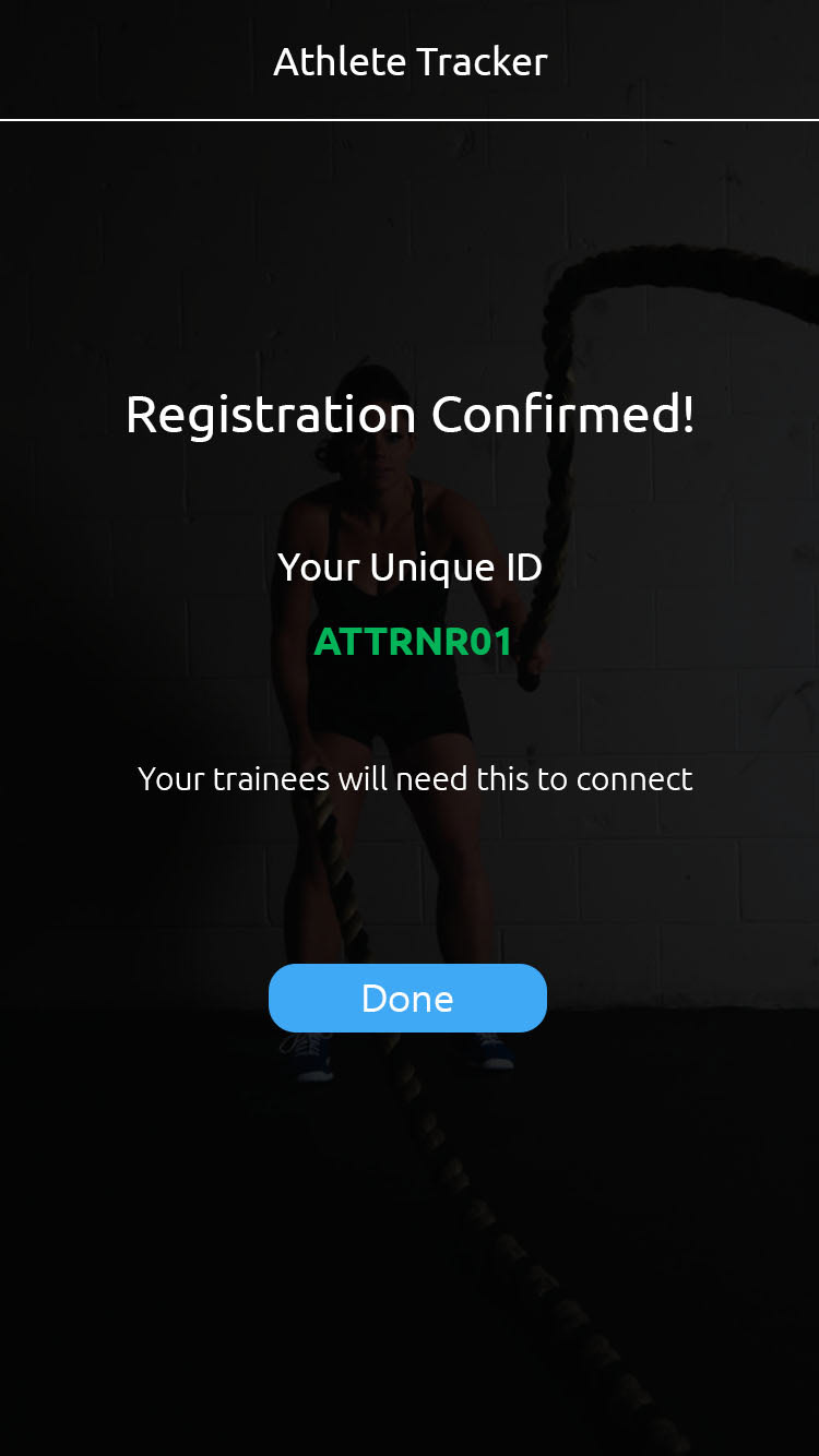
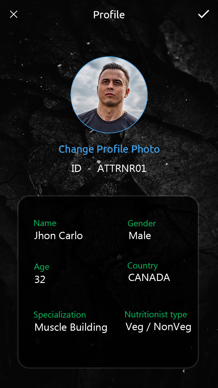
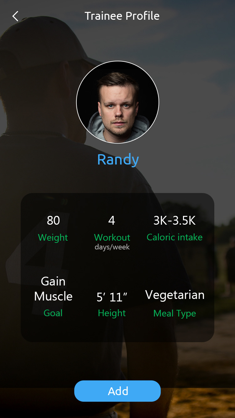
High Fidelity Application Design
After deciding the colour palette, designing a logo and selecting the typefaces, I started working on the UI part of the application.
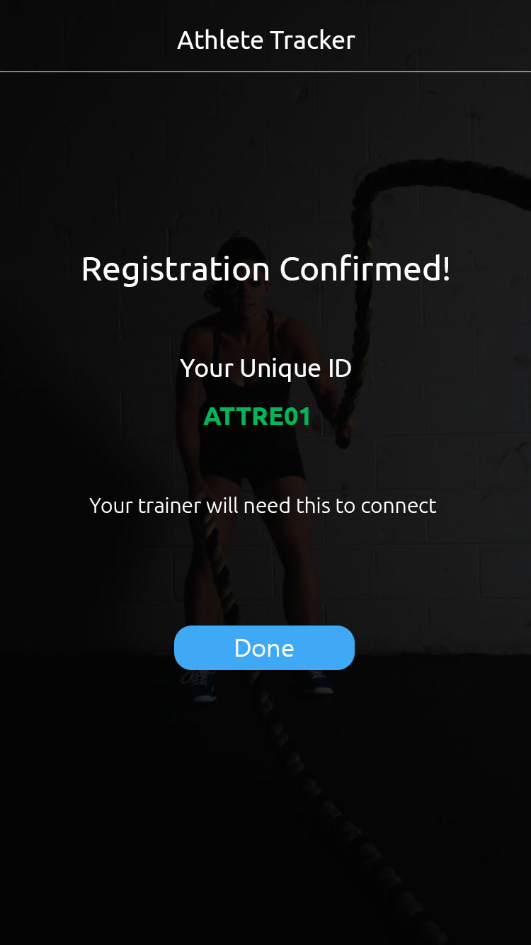
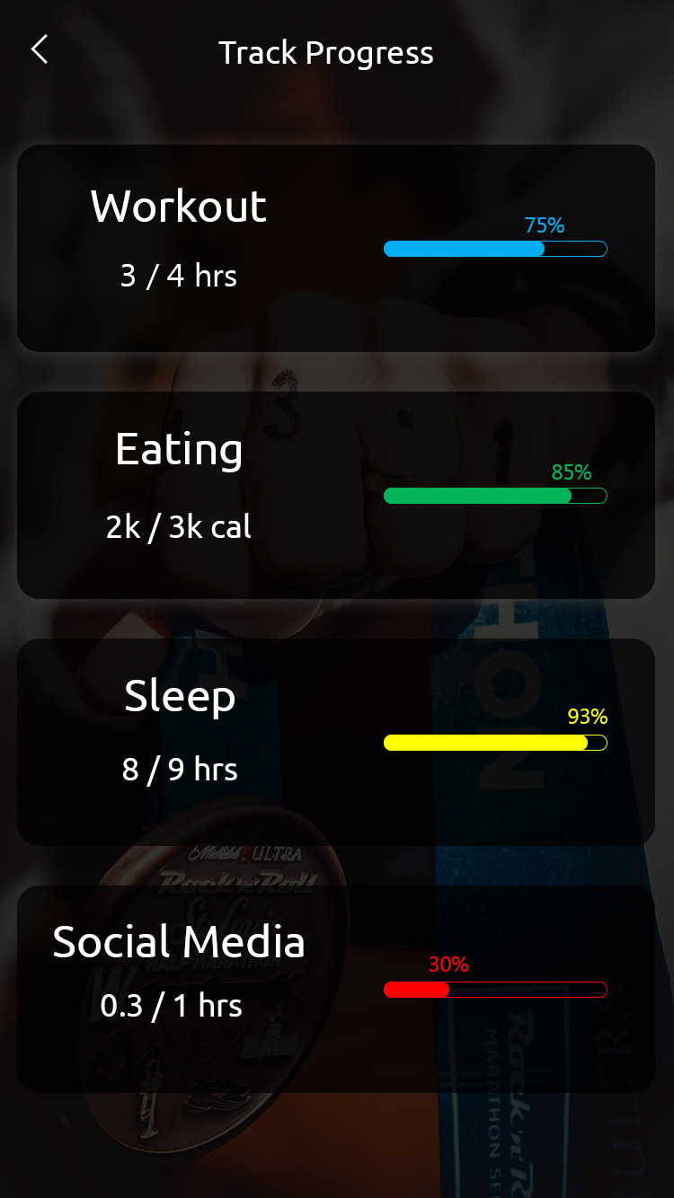
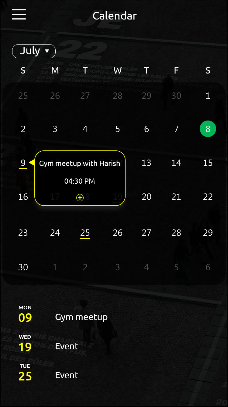
Trainee (Student):


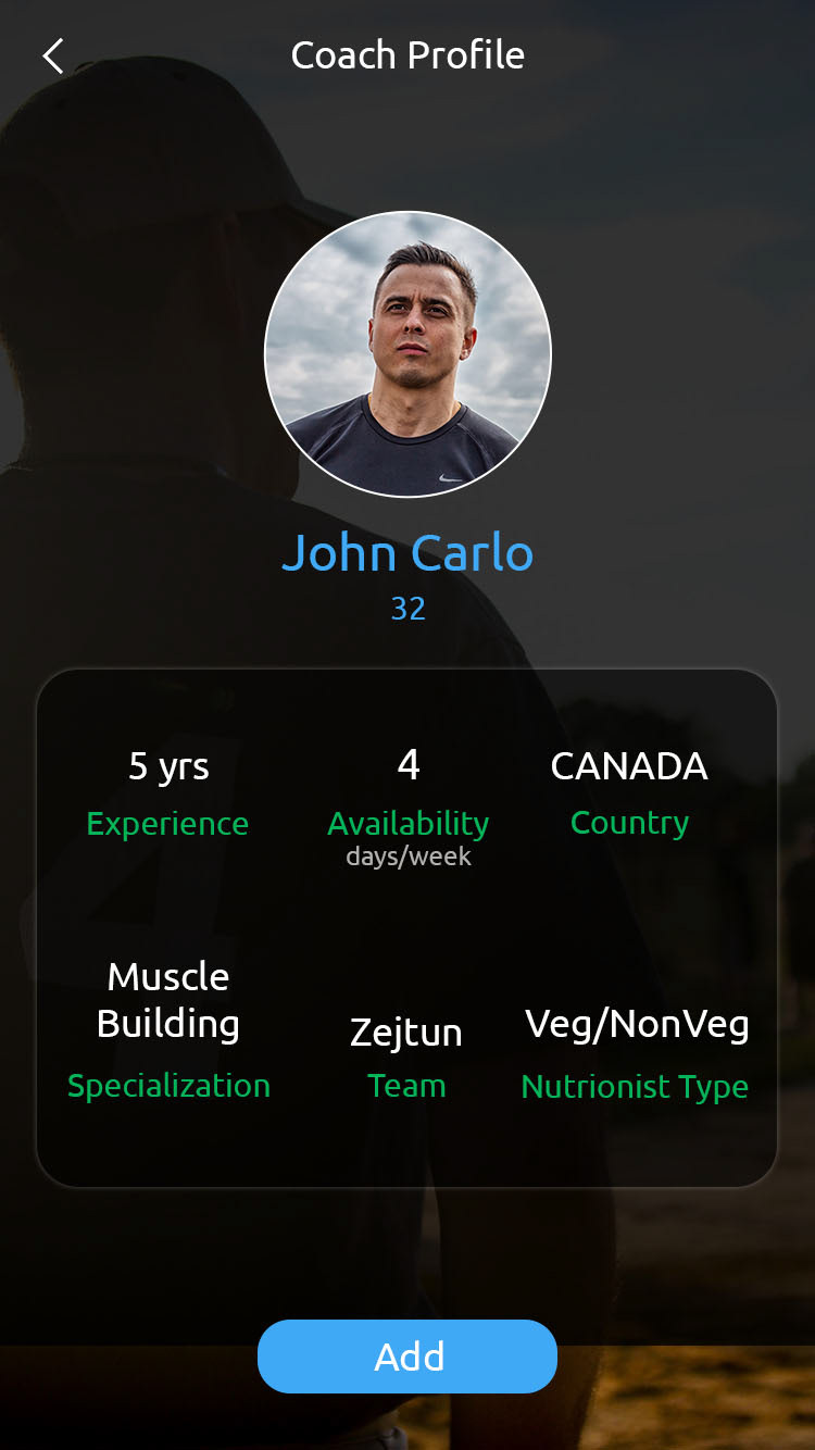


Trainer (Coach):


Click here to view the prototype on InVision.
Usability Testing
5 participants were invited for usability testing. A test script was prepared with some pre-test questions and tasks to be performed during the test.
Tasks
- Find Trainees list
- View schedule
- Add event to calendar
- Track progress
Click here to see full usability test script.
Thank You!